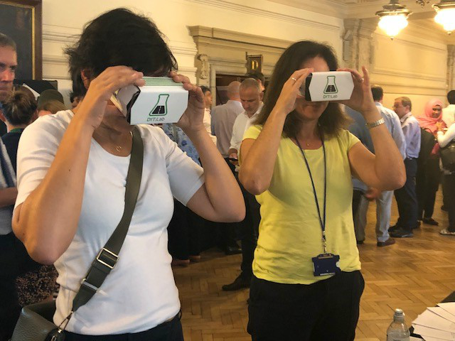
 DfT’s Rail Knowledge Management Team recently approached the Lab for help with a problem: new DfT employees needed to understand the complexities of the rail system. The rail team’s data suggested that site visits and tours were an effective way of building understanding of how the pieces of the railway work together, but these events happen infrequently. We wanted to prototype a solution that allowed all staff to access these opportunities at a time that suited them, and so ‘Virtual Raility’ was born: a virtual reality training tool for new staff.
Once the team had created the first version of the prototype, we began usability testing. Virtual reality was new to us all, and none of us were sure what a good user experience should look like or how to effectively test. So here’s what we learned:
Seeing what the user sees
Due to the availability of screens, we weren’t able to set up Chromecast or something similar that would allow us to cast what the user was seeing onto a bigger screen. To get around this, we ensured our discussion guide placed extra emphasis on asking users to ‘think aloud’ to describe what they were seeing, and asked users to complete tasks that would also allow us to understand where they were in the service. In future we’d make sure to arrange testing in a room with a screen and Chromecast to project their view.
Text or audio?
Users generally found the experience to be exciting, but struggled to take in the textual information in our first prototype. We learned that it’s very easy to overload the visual realm of VR, and subsequently added audio content to all our interaction points. This also made the app more usable for users with accessibility needs. We learned that people’s eyesight and hearing is highly variable, so next time we’d do a lot more testing, and ideally begin to implement settings for the user.
Making the journey clear
Users interacted with the app by focusing their gaze on hotspots that would expand and provide textual information on what they were seeing. Our first iteration made all the hotspots visible from the beginning, allowing the user to access whatever they wanted from the start. However, this lump of visual information overwhelmed the user and prevented us from applying a narrative to the content. Our next iteration guided the user, hotspot by hotspot, using a floating breadcrumb trail between points. Users much preferred this approach and it allowed us to provide a more structured learning experience which improved information retention.
Not all users can tolerate virtual reality for long
We read about users with less experience of using virtual reality having a lower tolerance for the technology – and our usability testing confirmed this. While some people were fine to go through the experience for 3-5 minutes, others stopped early and chose not to proceed. These users usually complained of feeling dizzy or giddy, or their eyes feeling a little tired. We learned a few lessons to reduce this affect:
-
- keep the users’ vision at head height
- place text at a consistent depth in the users vision
- keep the experience short
Get the motion right
One of the hotspots inside our service transported the user from Victoria Station to Clapham Junction. Earlier iterations of the prototype didn’t give the user any notice that they would be transported, so many found that they looked at a hotspot then suddenly moved through space to another station. We started affectionately referring to it as our Harry Potter-esque Floo Network and users found it variously exciting, startling and disorienting. Our later iterations of this interaction gave the user some notice of what was about to happen, and transported them more smoothly to the next scene.
If you’d like to learn more about how we built Virtual Raility in just 4 weeks, drop us a line at lab@dft.gov.uk