Along with Python, the R programming language is one of the most popular open source technologies for data science work. R is a programming language and software environment for performing statistical calculations and producing data visualisations.
At DfT, we're starting to use both R and Python to improve how we work with, and derive insights from, data. They’re helping us to:
- analyse datasets too big to load into Excel
- derive insights from the data
- automate the steps required to run our national transport models and forecasts.
I recently attended the Effective Applications of the R Language (EARL) conference - a good chance to improve our technical knowledge and gain inspiration from other sectors. A select few highlights were:
- Garrett Grolemund from RStudio on how we should collaborate and make our work and code reproducible by others [slides]
- Alice Daish from the British Museum on how the organisation has transformed to be data driven using R [slides]
- Louis Vines from Funding Circle on using R in a production environment to do real time machine learning (credit scoring) [slides]
- Tim Paulden from ATASS sports using R to predict football scores
- John Burn-Murdoch of the Financial Times on how R is used to quickly turn around prototype graphics for the newspaper
- Kenneth Cukier from The Economist talking about the future of machine learning and its impact on our society
We R the world
The conference highlighted how we can use programming to improve various processes and transport models, making them automatic instead of relying on manual editing of spreadsheets. We were shown a great video explaining the benefits of moving from spreadsheets to R programming to produce automated reports in Word, pdf and web formats.
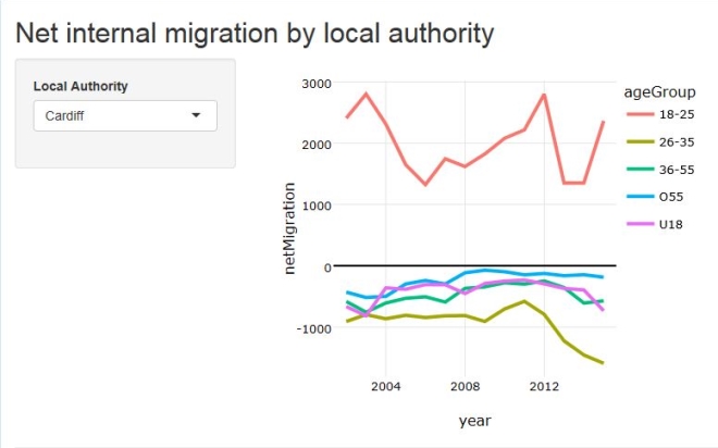
As well as automating tasks, data science techniques can be used to create interactive graphics and dashboards to improve the way we communicate our analysis within DfT. An example is the interactive visualisation that we were able to rapidly create using R and data published by ONS to help us understand urbanisation trends for our traffic forecasting projects.
Another benefit is that, if you need to tweak an analysis or visualisation in some way, it's often quicker and easier to do this in R than to unpick a spreadsheet-based version.
R friends electric
There was a great turnout from the Government Data Science community at the conference. As a cross governmental group we mostly communicate through Slack, a digital communication tool, to help each other with data science issues and so it was good to put some real faces to online avatars.
Finally, it was a great opportunity to grab some extra stickers to add to my laptop!
Follow DfT on Twitter and don’t forget to sign up for alerts so you don’t miss out on updates